ROLE
PRODUCT DESIGNER
TEAM
1 PM
1 CONTENT DESIGNER
3 SWEs
TOOLS
FIGMA
CURSOR
FOCUS
0 → 1
PRODUCT DESIGN
WORKFLOW DESIGN
Credentialing Workspace: Scaling Provider Onboarding
CONTEXT
Operations agents were responsible for moving hundreds of provider applications through a complex credentialing process.
Operations agents were responsible for moving hundreds of provider applications through a complex credentialing process. But information was scattered across spreadsheets, forms, and internal systems, making it difficult to understand an application's status, identify what needed attention, and move cases forward without constant context switching.
Spreadsheets and disorganized forms
PROBLEM
Making complex credentialing workflows manageable
Operations agents had to piece together provider information across spreadsheets, forms, and internal systems. They lacked a clear view of application status, what needed attention, and what action to take next. As volume grew, keeping applications moving became increasingly difficult.
RESEARCH
Understanding how credentialing work gets done
I mapped the credentialing workflow and observed and interviewed ~10 operations managers and agents to understand their day-to-day processes and pain points.
Agents were reconstructing context instead of resolving cases
Knowing what to do next was just as important as having the information
The workflow needed to accommodate growing complexity
INSIGHTS
Provider credentialing at Mochi is fragmented and slow, causing risks to revenue and patient access
🧩
Fragmented
Agents had to piece together provider verification histories across multiple systems, making it difficult to resolve issues quickly.
❓
Ambiguity
Without a clear view of what needed attention, agents struggled to identify which applications or credentialing tasks to address first.
📈
Scaling Limitations
Inconsistent workflows and repetitive follow-ups made it increasingly difficult to manage growing application volume.
PRODUCT GOAL
Bring application status, supporting information, and next steps into one place so agents can resolve cases efficiently and keep providers moving through onboarding
Increase in number of completed applications by agent per week
Increase in number of successful applications per week
Decrease in average provider onboarding workflow time
Decrease in steps of credentialing workflow
PRINCIPLES
Guiding design principles
Surface actionability
Make it immediately clear to agents what requires attention and what actions should be taken
Support information density
Present complex information to help agents quickly understand context and make decisions without jumping between disconnected systems
Design for scale
Create reusable components and patterns that support increasing patient and provider volume without adding operational complexity
PROCESS
INFORMATION ARCHITECTURE
Exploring how information is organized
Some ideas validate our assumptions, while others exist to challenge them.
IA explorations
CHALLENGE #1
How should agents focus on tasks?
Split view vs. expandable rows
Expandable rows were simpler and more lightweight, but became crowded when agents needed to review multiple types of information. A split view introduced more structural complexity, but gave agents room to work while keeping the application queue visible.
Decision: Prioritize a more capable workspace over a simpler interaction.

Expanded row did not take advantage of screen surface area and had too many competing elements
Split screen provided a focused interface in which to complete case tasks
CHALLENGE #2
How should case information be presented?
Tabs vs. keeping information visible
Tabs created a cleaner, more contained interface, but required agents to move between sections to cross-reference information. A consolidated view exposed more information at once, but required careful hierarchy to avoid overwhelming users.
Decision: Prioritize visibility and cross-referencing over minimizing the amount of information on screen.

Scrolling to view information is time consuming and requires too much context switching
Viewing different types of information at once allows for a full picture of how to complete case
CHALLENGE #3
How do we create a robust filtering system?
Filtering vs. prioritization
More filters gave agents flexibility, but too many options could make the queue harder to navigate. A more opinionated approach could surface important work faster, but risked hiding cases agents still needed to find.
Decision: Balance flexible filtering with clear signals about which applications needed attention.

Limited and unintuitive filters made sorting hundred of cases inefficient and unusable
Balance between types of filtering to refine cases and make completion more manageable
ENGINEERING COLLABORATION
Engineering initially had concerns about implementation complexity
Rather than relying solely on static Figma designs, I used Cursor to prototype the interactions and demonstrate how the workspace would function. This gave engineering a more concrete way to evaluate the proposed experience, discuss implementation details, and work through the interaction patterns together.

DESIGN SYSTEM
Building a foundation for operational tools
As the workspace introduced new interaction patterns, I worked with engineers to extend Mochi's design system. I defined reusable components, states, and behaviors, then refined them alongside implementation to establish consistent patterns for future internal tools.
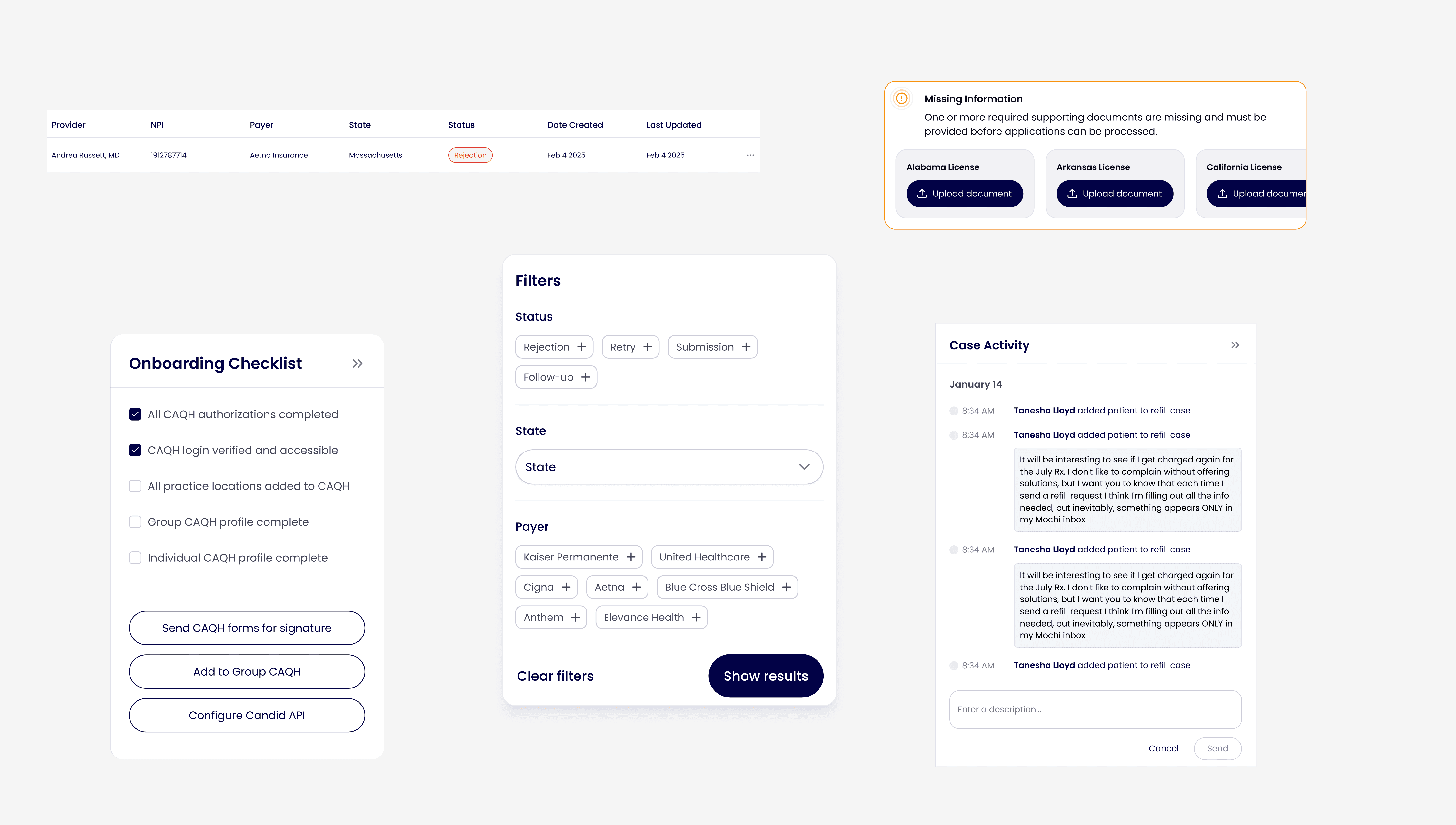
New components
SOLUTION
PROACTIVE CREDENTIALING
Stay ahead of license expirations
Expiring cases are surfaced on the dashboard to avoid credentialing delays allowing providers to practice seamlessly.
SPLIT VIEWS
Effortlessly multitask without context-switching
Agents can cross-reference information across systems in real time, helping to verify details quickly, reduce context switching, and resolve tasks more efficiently.
End-to-end licensing support

Seamless multi-state licensing
IMPACT
A unified workspace for faster case resolution
The new workspace gave operations agents a more actionable way to manage provider credentialing at scale. By reducing the time spent searching for information and clarifying next steps, agents could process more applications while helping providers get credentialed and see patients sooner.
150% increase in completed applications
With the right steps surfaced up front, each agent finished more applications a week
Provider onboarding reduced by 60%
A guided flow replaced back-and-forth emails, so providers got to their first patient faster from 13 days to 5
Average time spent on credentialing workflow decreased by 58%
Fewer missing documents meant fewer delays for the team reviewing them