CASE STUDY
CORE EXPERIENCES, MOCHI MOBILE APP
ROLE
DESIGNER & UX RESEARCHER
TEAM
2 PRODUCT DESIGNERS
1 PM
4 SWEs
1 CONTENT DESIGNER
TOOLS
FIGMA
CURSOR
Mochi Mobile App: Turning patient progress into clear next steps
CONTEXT
Mobile was the primary care experience for 30% of patients
Although most patients accessed Mochi through the web, roughly 30% relied on mobile as their only way to manage their care. Improving the app wasn't simply a visual refresh. It was an opportunity to make care easier to access, reduce friction around critical tasks, and create a more consistent patient experience.
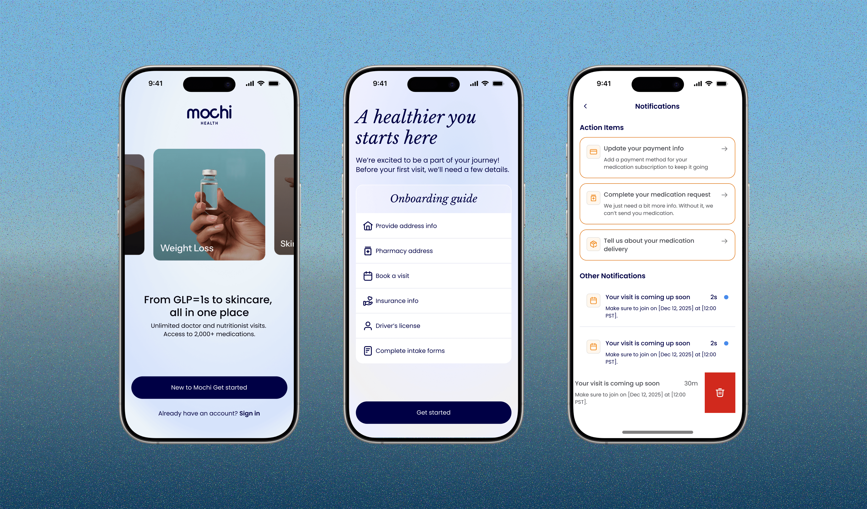
My goal: Create a more cohesive mobile experience that helped patients understand their care, complete important actions, and stay connected between appointments. I led design across sign-in, home, and notifications, while helping establish a scalable iOS design system.

PROBLEM
Patients could see their progress, but not what to do next
The home screen relied on badges and percentages to communicate care progress, leaving patients to navigate elsewhere to understand what needed their attention.
How might we help patients understand their care status and take the right next step from the moment they open the app?

App store reviews
HYPOTHESIS
Putting patients' most important next steps front and center
If we show patients their most important action items prominently on the mobile home screen, in priority order, then more users, especially new patients, will complete the steps their care depends on.
USER RESEARCH
Understanding where patients get stuck
I audited the existing mobile experience, analyzed which action items patients most frequently missed, and interviewed 15+ patients to understand their needs, motivations, and challenges when completing care-related tasks.
Unclear care status
Patients couldn't easily understand where they stood in their care journey or whether something needed their attention.
Important actions were easy to miss
The home screen emphasized progress and information, but didn't clearly surface the next steps patients needed to complete.
Inconsistent experiences eroded confidence
Inconsistent interactions and communication across the app made it harder to navigate care with confidence.
PRINCIPLES
Defining principles
If we show patients their most important action items prominently on the mobile home screen, in priority order, then more users, especially new patients, will complete the steps their care depends on.
Prioritize what matters most
Surface the actions with the greatest impact on a patient's care first, rather than presenting every task with equal weight.
Make progress feel manageable
Break complex care journeys into clear, approachable steps. Help patients understand what they need to do without making their to-do list feel endless.
Keep action within reach
Give patients enough context to understand each task and make progress directly from the home screen, without unnecessary navigation or hidden interactions.
IMPACT
A more actionable experience, with measurable results
By making care-critical actions easier to find and complete, the redesigned experience helped more patients move forward in their care journey, reduced cancellations, and improved patient sentiment around the app's usability.
+30% action item completion
More patients finished the steps their medication depends on.
-8% membership cancellations by day 60
Patients who knew what to do next were more likely to stay.
+8% notification opt-in
Patients found the reminders useful enough to keep.
PROCESS
CHALLENGE
Balancing glanceability with actionability
My first iteration prioritized simplicity by surfacing one primary action and collapsing the remaining tasks. But feedback revealed that hiding outstanding actions made it easier for patients to overlook important steps.
I shifted toward a more visible action-oriented layout, making outstanding tasks easier to scan and complete without adding another layer of navigation.

ITERATIONS
How much of the patient's care journey should the home screen expose upfront versus progressively reveal as they engage?
Visibility vs. cognitive load spectrum
I explored different levels of information disclosure to understand how much of the care journey patients needed to see upfront. A minimal approach kept the interface focused but buried important actions, while displaying everything at once risked overwhelming patients. I explored progressive and contextual interactions to find a balance between making tasks discoverable, communicating priority, and keeping the experience manageable.

Iterations

Iterations
TURNING POINT
It was never how many tasks to show, but which tasks to surface
With our PM and content designer, I mapped the logic behind every card that could appear on the home screen: what triggers it, what it blocks, and how soon it matters. From that, I defined three priority rules.

Action item logic
SOLUTION
TURNING POINT
It was never how many tasks to show, but which tasks to surface
With our PM and content designer, I mapped the logic behind every card that could appear on the home screen: what triggers it, what it blocks, and how soon it matters. From that, I defined three priority rules.
TURNING POINT
It was never how many tasks to show, but which tasks to surface
With our PM and content designer, I mapped the logic behind every card that could appear on the home screen: what triggers it, what it blocks, and how soon it matters. From that, I defined three priority rules.

TURNING POINT
It was never how many tasks to show, but which tasks to surface
With our PM and content designer, I mapped the logic behind every card that could appear on the home screen: what triggers it, what it blocks, and how soon it matters. From that, I defined three priority rules.

FINAL
Takeaways
Sometimes the fastest way to understand a user is to become one
When access to users was limited, I subscribed to Mochi myself and went through the entire patient journey, from onboarding and sign-up to notifications and ongoing care. Experiencing the product firsthand helped me uncover friction that wasn't always visible in analytics or existing feedback. It gave me a more immediate understanding of what patients experienced, where they felt uncertain, and what a more seamless care journey could look like.
A mobile experience has to be experienced on mobile
Designing on a desktop only tells part of the story. I learned to build functional prototypes early and test them directly on my phone, where interactions, scrolling, hierarchy, and touch targets felt entirely different from how they appeared in Figma. Experiencing the interface in its actual context helped me catch usability issues earlier and make better decisions about the details that shape a consumer mobile experience.