CASE STUDY
CORE EXPERIENCES, MOCHI MOBILE APP
ROLE
DESIGNER & UX RESEARCHER
TEAM
2 PRODUCT DESIGNERS
1 PM
4 SWEs
1 CONTENT DESIGNER
TOOLS
FIGMA
CURSOR
YEAR
H2 2025
Credentialing Workspace: Scaling Provider Onboarding
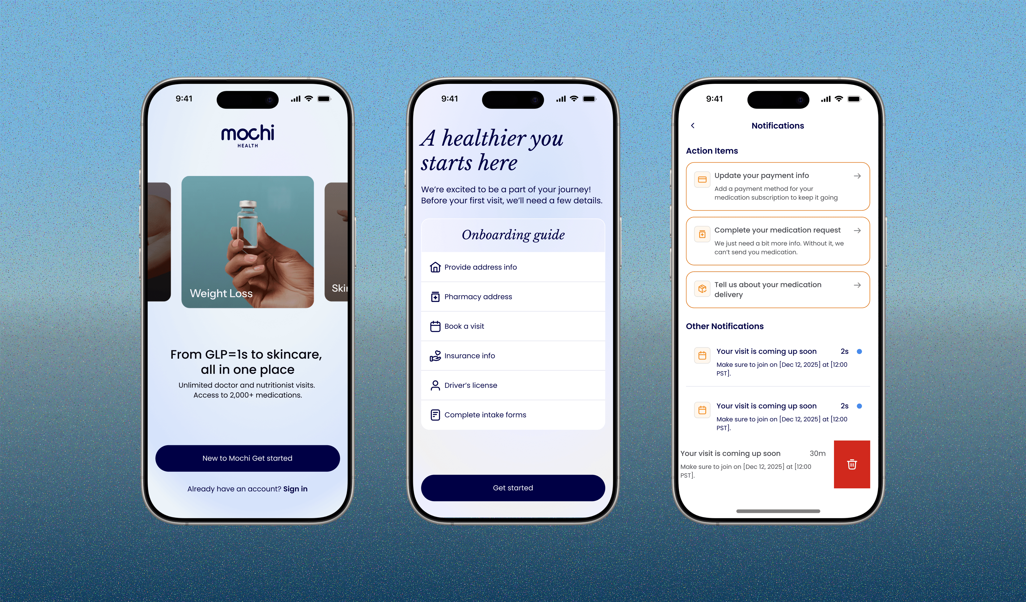
Problem
Patients could see their progress, but not the next steps in their care journey leading them to miss important actions.
The home screen showed progress badges and percentages instead of telling patients what to do next, which was hidden behind another screen. For new patients still learning the refill rhythm, a screen that says you're "80% complete" doesn't tell them which step is missing, or that missing it will delay their medication.
Hypothesis
If we show patients their most important action items prominently on the mobile home screen, in priority order, then more users, especially new patients, will complete the steps their care depends on.
How might we get patients to complete important actions without overwhelming them with a long to-do list?
Solution Overview

Before and after
Impact
+30% action item completion
More patients finished the steps their medication depends on.
-8% membership cancellations by day 60
Patients who knew what to do next were more likely to stay.
+8% notification opt-in
Patients found the reminders useful enough to keep.

before and after
Process

V1
V1 surfaced one primary onboarding card and hid the remaining action items behind "See more / See less," to avoid overwhelming patients while still driving action.
What didn't work in V1…
To test the first version, I put early prototypes in front of patients in short, focused sessions.
🫥
40% missed a hidden task
Collapsed tasks made required actions easy to miss and added a tap just to see what was outstanding, which cut against the goal of getting patients to act.
An endless to do list
The first version showed every task at once. Patients found it overwhelming. It read like an endless to-do list, and with everything weighted equally, they couldn’t tell what to do first.
Going from V1 to final, I was balancing actionability against glanceability. Patients needed to see everything that mattered at a glance without feeling overwhelmed, but also be pushed to act on it.

Iterations
The turning point
It was never how many tasks to show. It was which ones.
With our PM and content designer, I mapped the logic behind every card that could appear on the home screen: what triggers it, what it blocks, and how soon it matters. From that, I defined three priority rules.
Show only what needs action
If a task doesn't need the patient right now, it doesn't earn space on the home screen.
Order by urgency
The task most likely to delay medication always comes first. Less urgent items live one tap away in the full action center, so the home screen stays focused without hiding anything critical.
Clear items that are completed
Completed tasks disappear, so the list shrinks as patients make progress, which is itself the progress signal.

Action item logic
Final Solution