CASE STUDY
BENTO DESIGN SYSTEM
ROLE
DESIGNER
TEAM
MOCHI HEALTH
TOOLS
FIGMA
STORYBOOK
YEAR
2025
Redesigning Mochi's internal facing design system and adding new components.
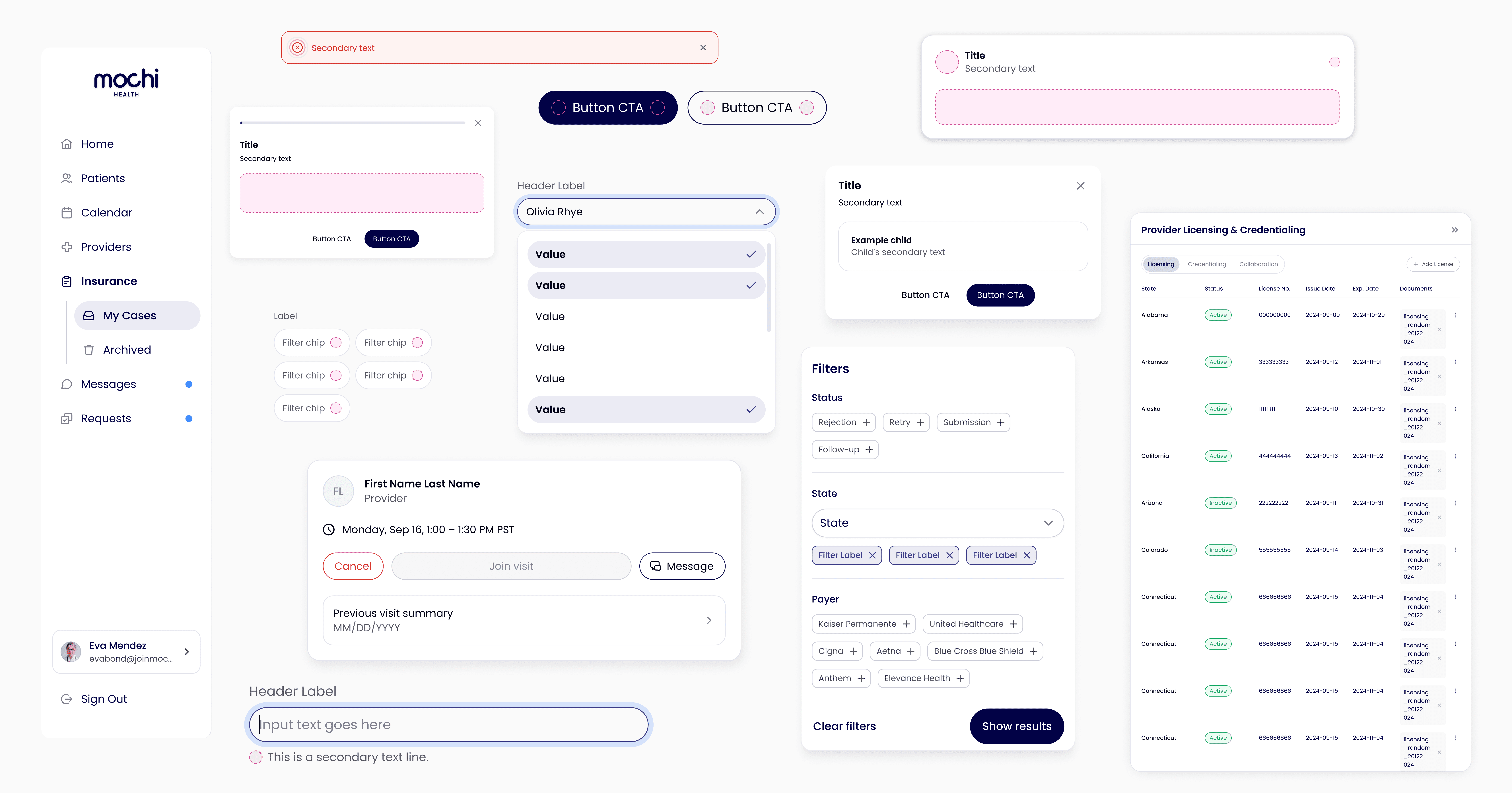

Context
Unifying internal portals under one design system.
As we scaled across the provider, operations, and pharmacy portals, teams kept designing similar chart, table, and data-heavy components in inconsistent ways — creating growing design and tech debt. We solved this by building a unified internal design system tailored to these data-dense needs.
Previously…
The original system grew reactively rather than by design. There were inconsistent styles across components, bloated configurations built to patch individual use cases, and layouts that varied from screen to screen.

Old design system
Creating a base
Tokens
Utilizing a two-tiered token system, we created primitive tokens for raw values like colors and spacing, and semantic tokens that mapped those primitives to meaningful and contextual roles across the design system.

Token hierarchy

Semantic color tokens
Components
I had ownership of creating an entirely new set of components for the operations portal, refactoring the product end to end and designing each component with slots to allow for maximum flexibility across use cases.
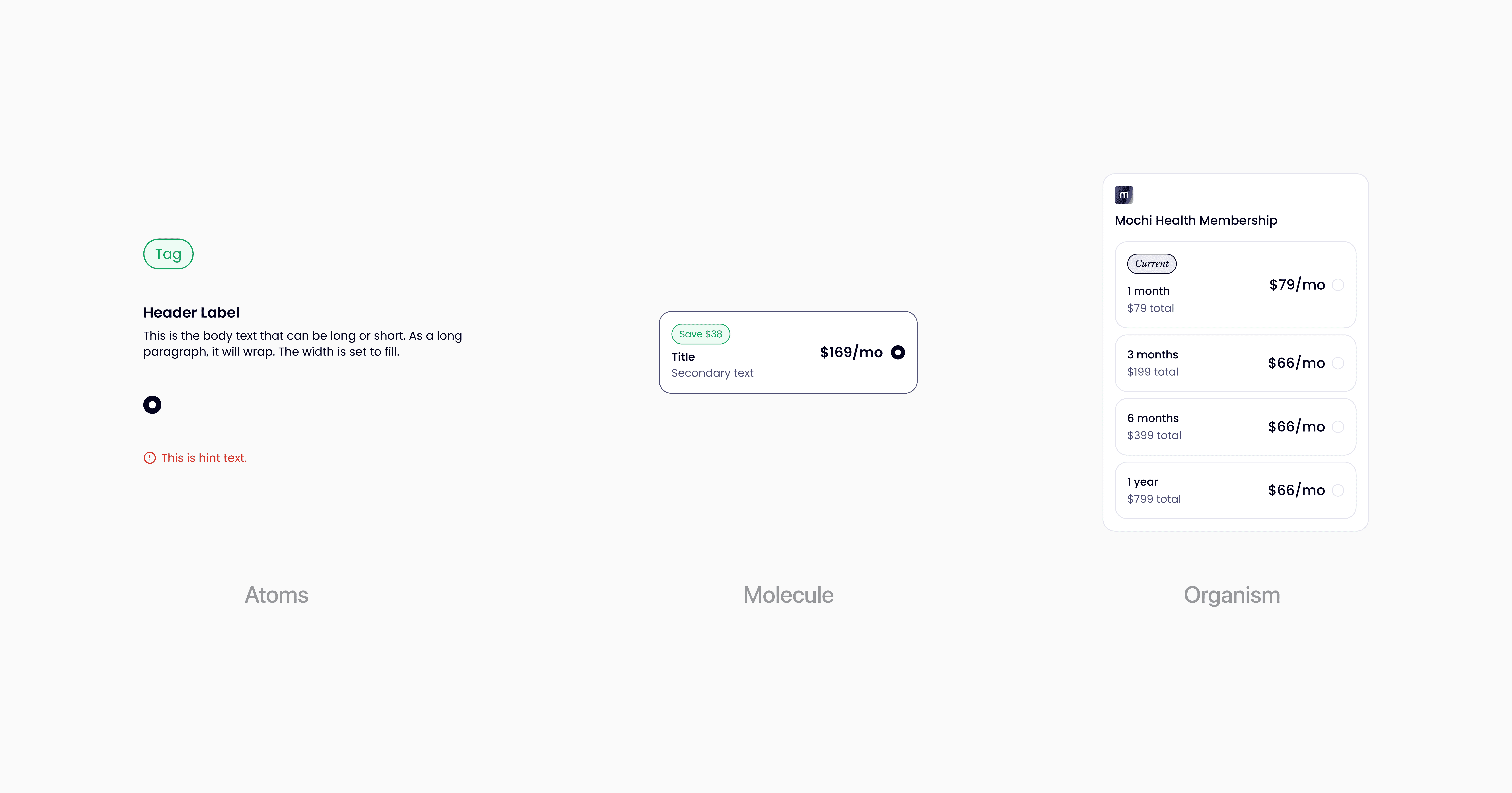
Atomic design system

Component parameters

Refactored ops portal
What was the outcome of all this?
The result was a unified design system adopted across all three internal portals. I led QA sessions with the design team to ensure consistency before handoff, then partnered closely with software engineers to implement components in code, using Storybook to document and validate each one against its design spec.
This collaboration consolidated dozens of redundant, one-off component variants into a single flexible, slot-based version, cutting the number of duplicate components in the codebase by an estimated 40%.
